Water Winners
January 2016
The Student Hotel, Wageningen University, Amsterdam University of Applied Sciences
Purpose of the project:
The design challenge for this project was:
How can we make residents of The Student Hotel use less water in their room?
Since The Student Hotel has a fixed price, incorporated in the rent, for water, people don’t particularly care about their water usage. But the bill does get high for The Student Hotel in its entirety. So, we have to design something which saves The Student Hotel money, but doesn’t change anything for the residents except that they can use less water.
Next to that, this project was connected to other classes we had about persuasive design. So we had to incorporate several persuasive patterns.
Deliverables:
A visual prototype and a document with the process, literature and product described.
My role:
In a team of 3, I was the project manager. Dividing tasks and taking care of the planning had my main focus. As for the rest, we did all the concepting, wireframing, prototyping and designing together.
After visiting The Student Hotel and seeing the rooms and common areas, we created a persona: a 23 year old British guy living in The Student Hotel. He doesn’t mind being aware of his water usage, but he would be annoyed if it would change his daily routine a lot. He’s competitive and being able to beat someone at a game, motivates him.
We started concepting by week 2 by first writing down what matters most. Saving money matter most and then to raise awareness of a residents’ water usage. Our main goals for the product would be raising awareness and motivating people.
In week 4, we gave a concept presentation where we had the idea that there would be a screen in the bathroom, in the shower and in the shared kitchen with water usage stats.
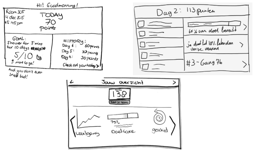
We all sketched 3 options per screen. In the sketch above you can see 1 option per person. After debating the sketches and what had to be included, (date, points, hall, personal goal, history, progress) we came up with the sketch below:
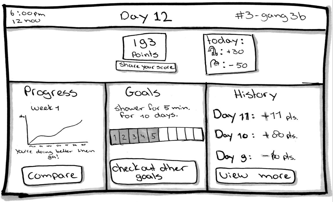
You immediately see your points and you can share it with the screen in the kitchen. That way, people can influence each other and it gives you authority.
As for the style, we all made a style tile, but decided to use the style that The Student Hotel uses on their website. We did change the color blue and also added more blue, but that’s obviously because it’s about water.
We made prototypes for the first version of our product: The first version of the bathroom screen, kitchen screen and shower screen.
We tested these prototypes with some students. We gave them a couple tasks and asked them to think out loud. A lot was clear to them, but some screens were too busy or text heavy and not all the content was consistent. We made a list of bits to change and divided them in the team.
Water Winners is a game where residents in The Student Hotel get points by using less water than the average. After a certain time, a hall (consisting of 12 rooms) will lose, and a hall will win. The losers think of a reward for the winners. The people in the halls need to work together to get below average. Because the whole game is based on averages.
Wageningen University knew that the average resident used 40 liters of warm water in 11,4 minutes. We changed the average in the game to 7 minutes which is about 28 liters. That way, if someone showers higher than the average in the game, it still changes the water usage in the hotel!
The end product is a Marvel prototype and can be found here. It consists of 4 scenarios. One we went through in our end presentation. The other 3 are for the bathroom, kitchen and shower screen. If you don’t know where to click, Marvel will show you.
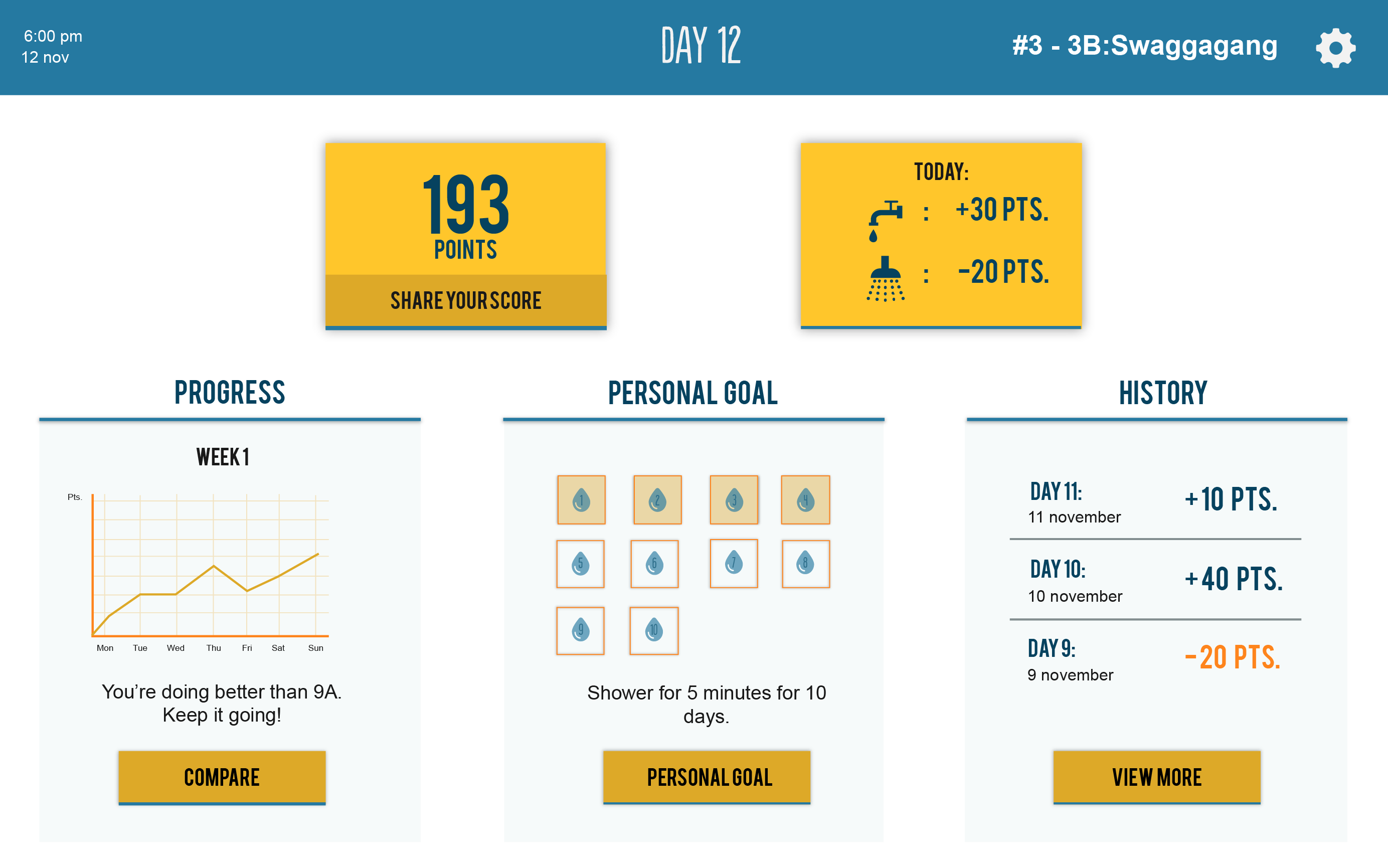
The bathroom screen with your points, your stats, progress, personal goal and history.
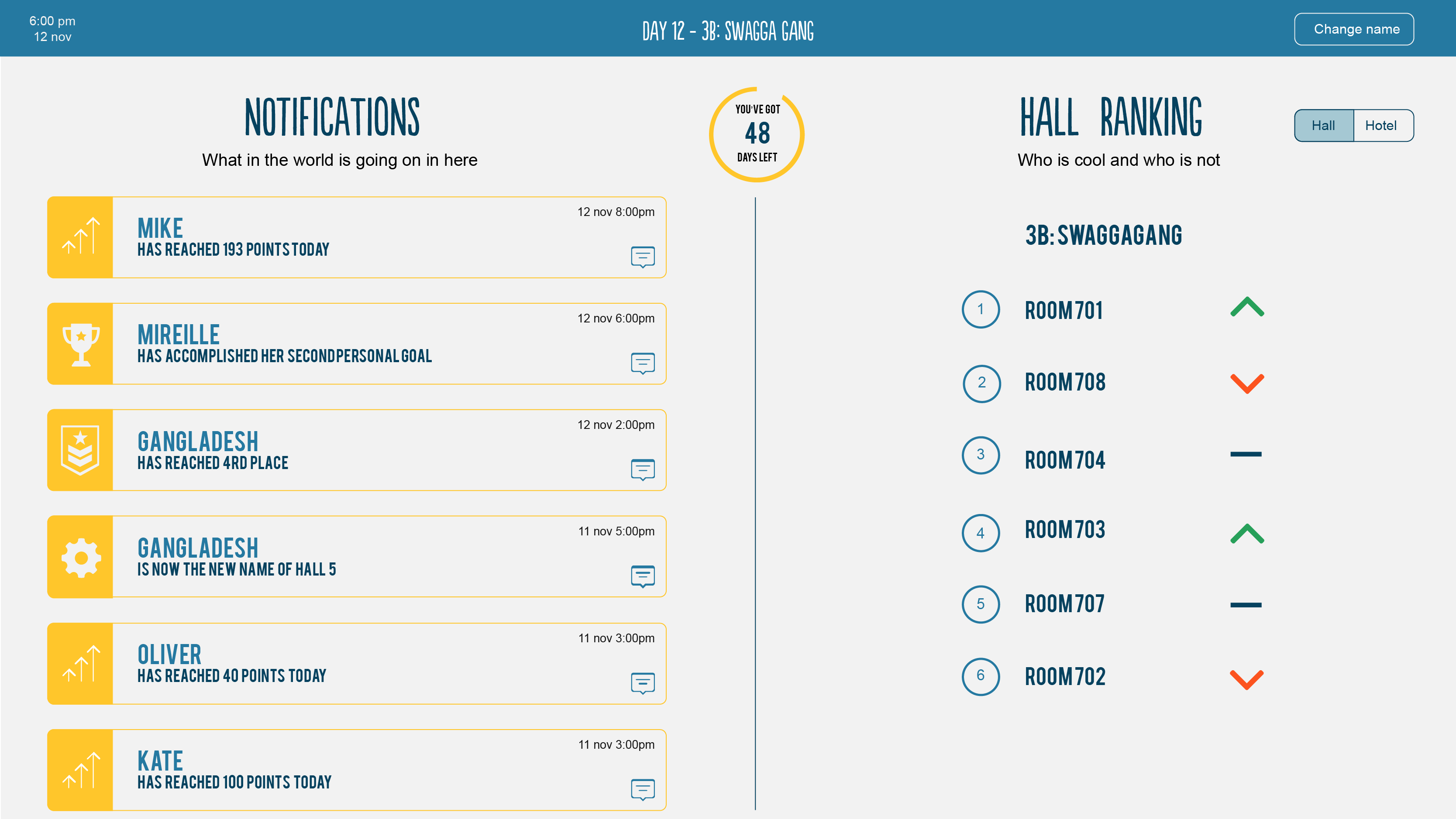
The kitchen screen with notifications a.k.a. the shared scores of others and regular updates. Also the hall ranking which shows how every room is doing. We didn’t add names or points to add anonymity.
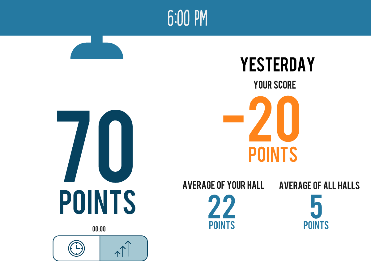
The shower screen with your points (70 points = 7 minutes), your score from yesterday, the average of your hall and average of all halls. There’s the possibility to just see the points or see the actual time.
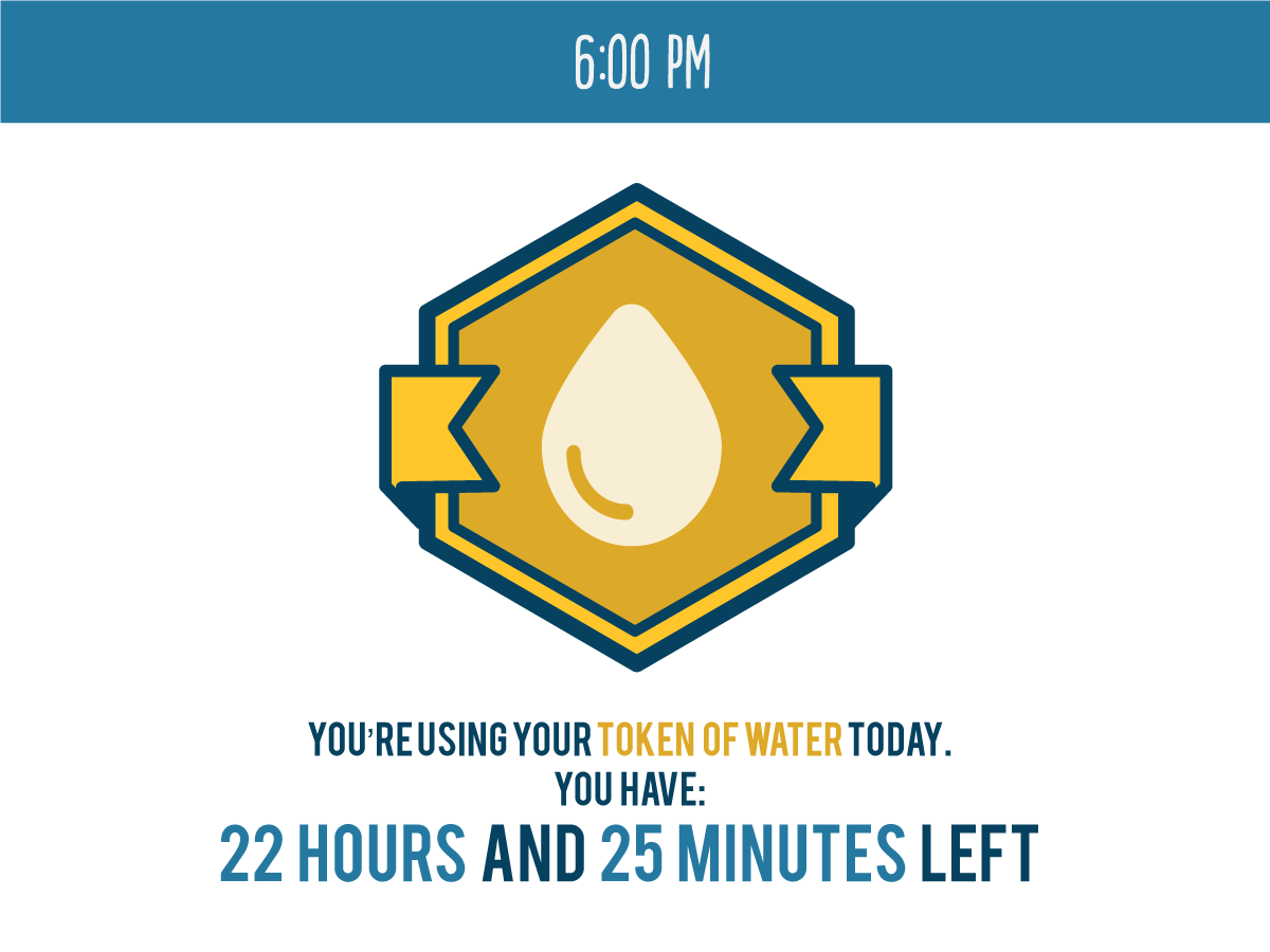
As something little extra, we added the Token of Water. Inspired by the persuasion principle scarcity. You don’t know when you’re gonna get it and when you do, you have it for a limited time. With the token, you can shower as long as you want for a day. You won’t gain or lose any points on that day. Later on, we realized we could’ve limited it to 30 minutes for example.
Because this project was connected to classes we had about persuasive design, we applied the 6 principles of persuasion by Dr. Robert Cialdini:
- Reciprocity: the losers of the water challenge come up with a reward for the winners.
- Scarcity: the Token of Water.
- Authority: you can share your score with your hall or the entire hotel on the kitchen screen.
- Consistency: residents can pick a goal and commit to it and stay consistent by trying to reach the goal.
- Liking: you can add emojis to a shared score on the kitchen screen.
- Consensus: we show people’s score in the kitchen and the shower to influence others to do better and follow suit.