Co-creation
February 2017
NHL University of Applied Sciences and A+O fonds Gemeenten
Purpose of the project:
Municipalities are working on co-creating with residents and entrepreneurs.
As a part of supporting this, they wanted a world map with tools to help people decide what to do with co-creation. It would consist of videos, tips and several documents.
Deliverables:
A responsive website.
My role:
Partially responsible for the interaction design and the visual interface. At some points, I had to take the lead.
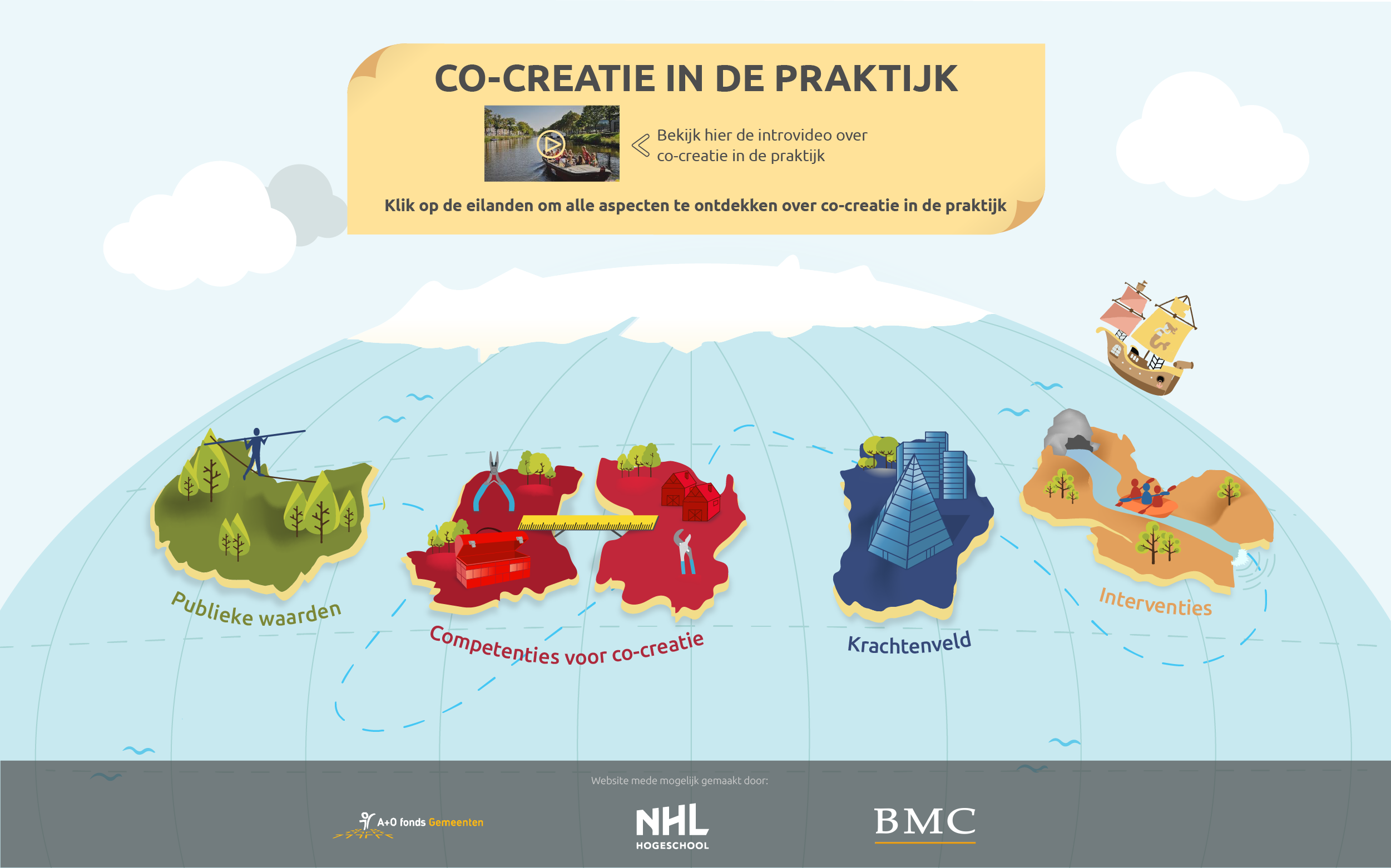
The client had the idea of a world map consisting of 4 islands. My supervisor asked if I wanted to sketch some ideas.
I didn’t want to just sketch a map, so these are some of my ideas:
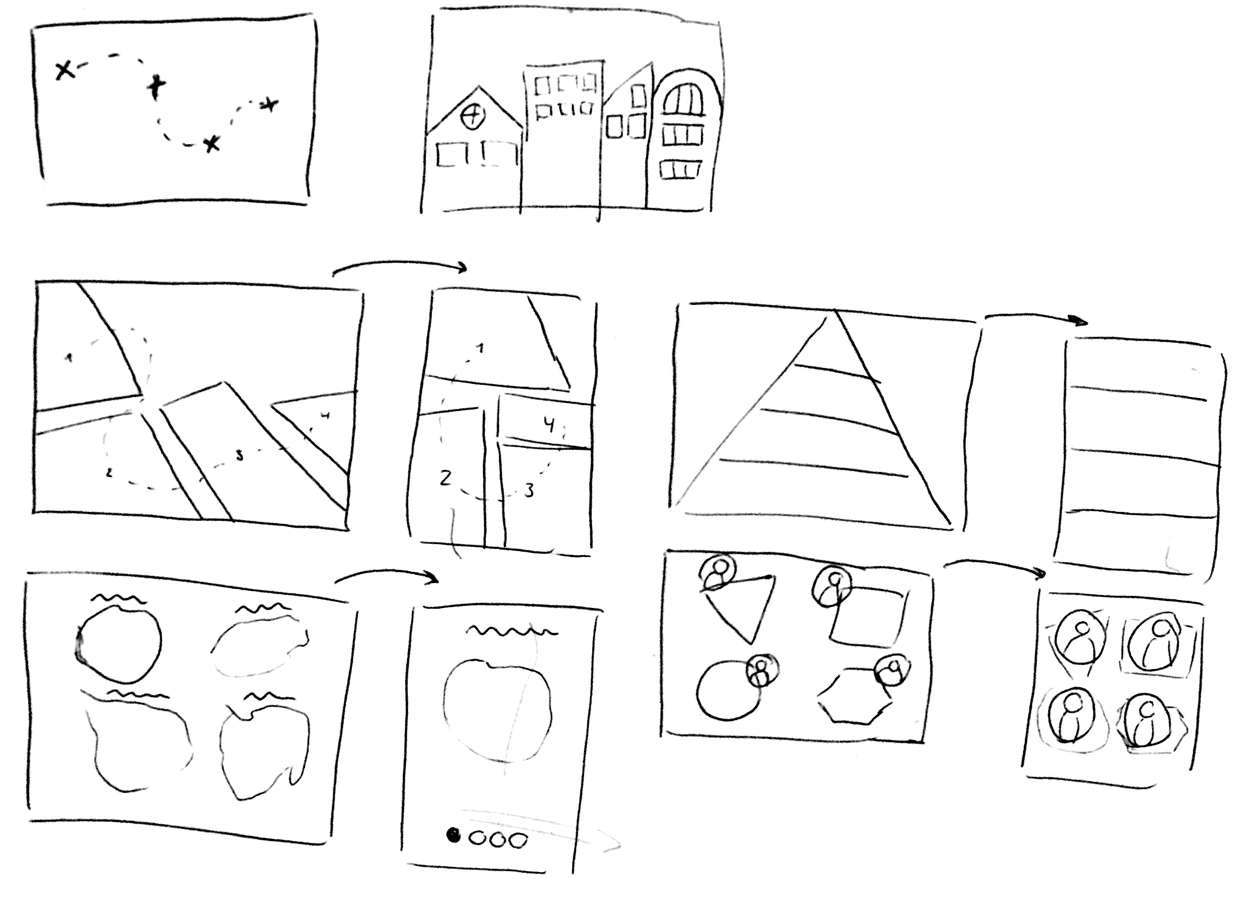
I thought of a treasure chest map, Dutch houses, 4 blocks like on a geographical map, 4 islands, a pyramid or 4 characters that each represent an island of some sort. I tried to think of what it would look like on desktop (left) and mobile (right).
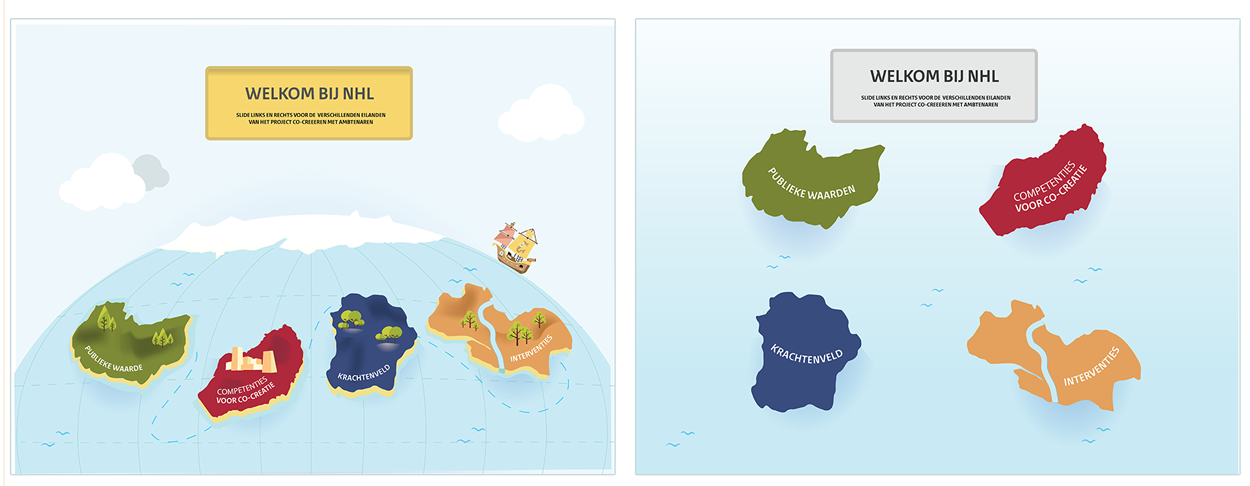
I showed these sketches to my supervisor and the developer (from a different company who is actually the link between designers and his team of developers) and we chose the 4 islands bit. We sketched together and came up with a globe with islands on it.
The person writing the proposal wanted to send a style proposal with their proposal + prices to the client. I am not used to this, because you’re just creating something you think the client wants rather than discussing it with them. Anyways, my supervisor made a “pretty” version. And I made a less appealing version.
Another unfortunate thing was that my supervisor, the person who would lead the project, got a new job and left the company. But, the client did want to follow through with the project. There was never really a discussion about who would take the lead for the project and the company hired a graphic design freelancer.
I worked together with the freelancer and we constantly divided tasks. But he wasn’t present every day, so I was indirectly responsible for the entire project. I proposed we both sketch the same pages and then bring ‘em together, sketch one version and continue. He mostly focused on making documents and I mostly focused on the web design.
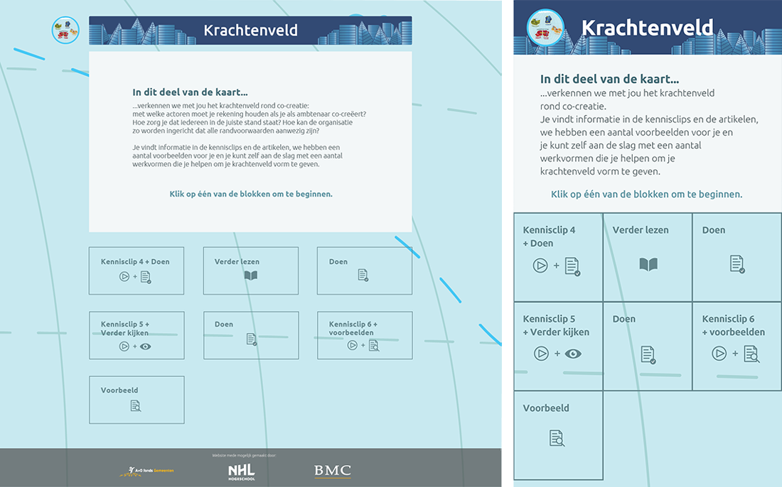
I had never worked with Sketch and thought I would just use it for this project. I made a first version with two options. I made them interactive in InVision and my supervisor sent ‘em to the client. The client and the developer chose the option below:
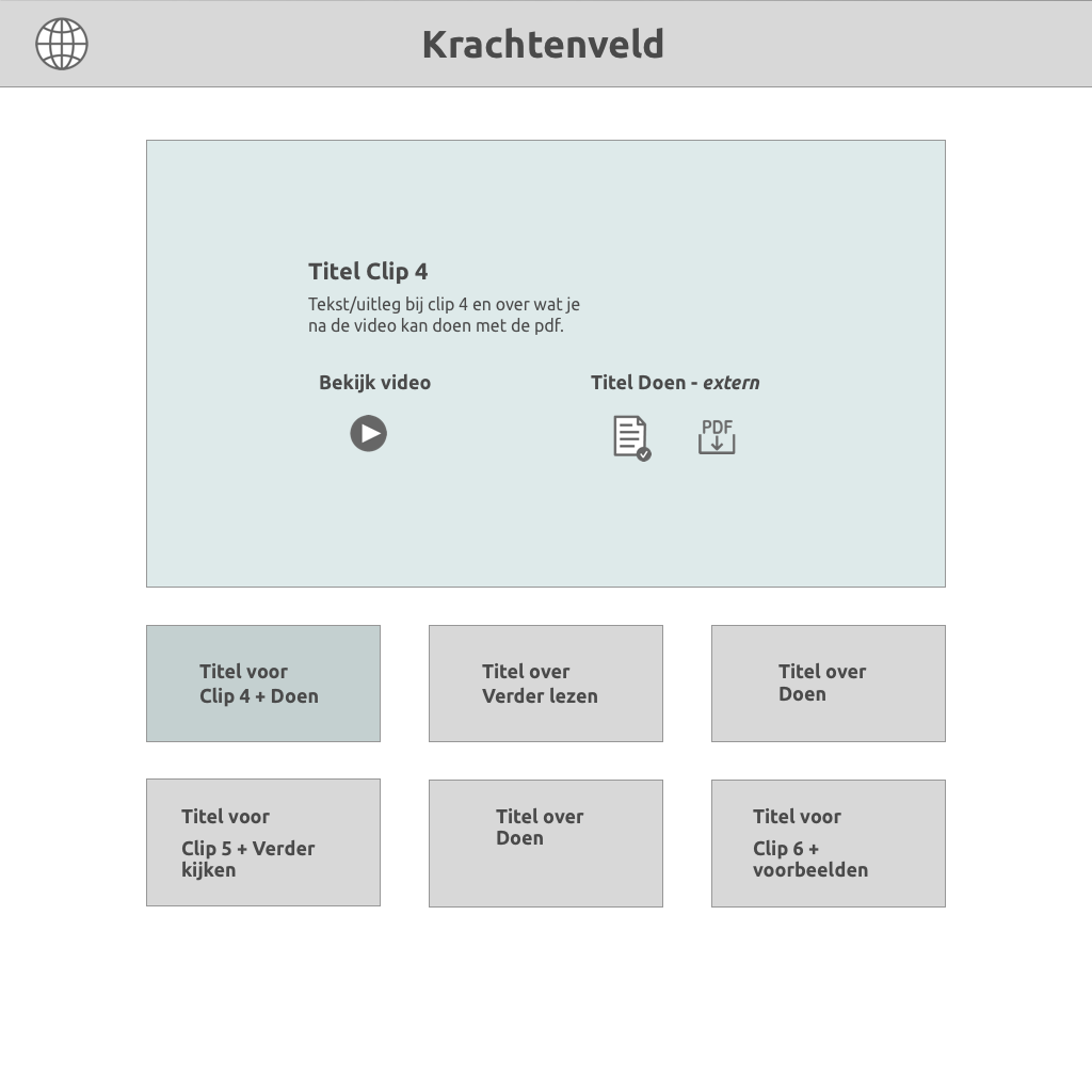 You can click on one of the 6 blocks and it would show up in the big block above. The freelancer saw this design in a template and I had to agree it looks nice, but wasn’t sure about the UI. Especially on mobile. Either way, it didn’t seem to bother anyone else, so we continued working on it.
I made 2 color options and some options for the color of the blocks.
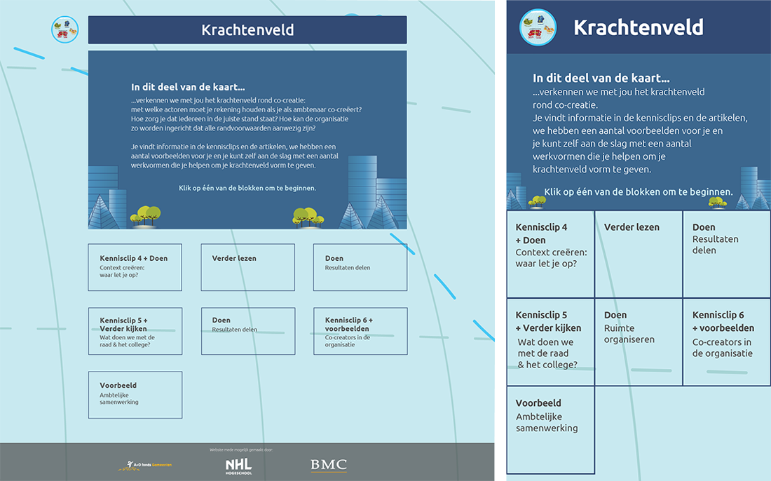
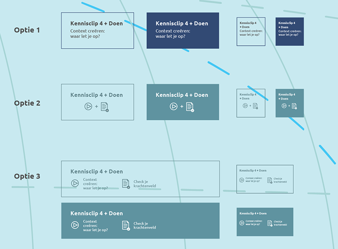
I did this in Illustrator instead of Sketch because I probably had to transfer these files to a different designer and no one at the company was familiar with Sketch. There was a discussion about the 4 colors of each island and if it should follow through to the blocks. Another thing we really struggled with before, was the content that was gonna be on it. They had a lot of videos and documents with a description for each in an excel file. We constantly asked them to keep the text to a minimum and let the content speak for itself. They did change the content sometimes, which made changing the design difficult because it was based on the exact amount of items they had.
There was also a lot of discussion with my supervisor about the design so I decided to present it at lunch for our colleagues. So, I made an InVision prototype again to show our colleagues and the client. My supervisor wanted to just show it and let people comment, but that way you get a lot of feedback you’re not looking for. So I had some clear questions on things I wanted feedback on. And eventually people will say what else they think anyway.
I continued working on new options for blocks. The day after, had a call with my supervisor and the client. She was really open and really easy about everything. She also agreed on using the colors from the islands on the blocks. They really envisioned it the way it was designed and were happy with the UI.
I could finally reach out to the developer again and discuss some points with him. Because everyone wanted to keep going, but I was like: Shouldn’t we ask the developer if this, this and that are possible?
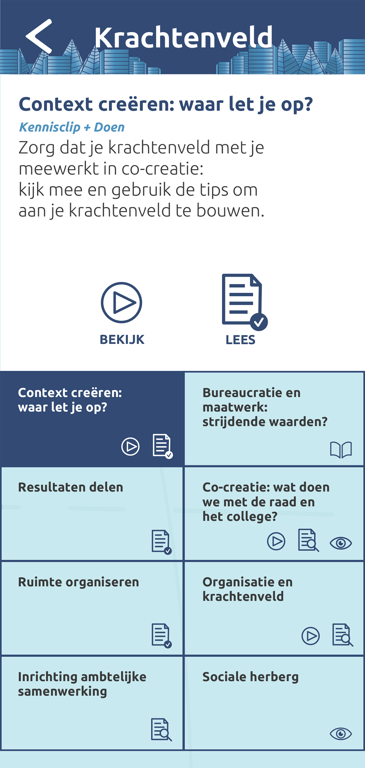
Once I did, it was time to continue and finish it. The final design changes were made and ready to be developed responsive as seen below.
Unfortunately though, my internship was ending and I couldn’t finish the entire project. The freelancer left and a new designer was hired. I transferred all the files and information to her.
I did look up what the end result looks like. You can find it here.
To be honest, I’m kind of disappointed to see how it is developed. It looks pretty rough and I wonder how the last couple of changes went.
Overall, I’m glad I never let anyone walk over me or treat me like I was less than them. At the moment, I was the only person remotely close to a web designer at the company and I think I handled it well. I did wish there was someone else who could’ve taught me more about making decisions in web design, but luckily the client was also easy to work with and they seemed happy.